
Risk Alive Analytics - OpenPHA
Design for Single Page Application (SPA) • User testing
Introduction
My role
Sole UX Designer – responsible for conceptualization, design, user testing and hand-off of new features
The team
1 product owner, 3 developers
Timeline
October 2022
Currently, there is no industry standard tool that helps the process engineers at to track completion progress of recommended safety actions. Companies tend to use several programs to track segmented information, and this disconnection of information makes it time-consuming and confusing for anyone in the refinery to find up-to-date process safety information. This stunts the spread of process safety knowledge and awareness, and can take time away from engineers and businesses.
How might we make updating process safety data with real time recommended actions tracking simple and intuitive, so that process engineers can centralize and evergreen process safety information?
Solution
The Recommendation Completion feature will allow for users to easily update their PHA with real time Recommendation progress. With minimal user input, the feature will add, edit, or remove PHA data such that the safety scenarios are reflective of the physical state of the plant. All data changes will be recorded and trackable so the user can refer to past changes.
Definition of Success
Taking into account the UX metrics, development constraints, and business goals, here are the measures of success I came up with:
Speed of completion for each recommendation
Reduction of steps/clicks
Number of positive customer feedback on the feature
Number of success stories from customers that resulted in paid subscriptions
Constraints
During the initial meeting with the PM, we agreed on the following design constraints:
No user interviews will be conducted prior to the ideating phase. Information hierarchy and overall design were based on my knowledge of the user needs from other meetings and conversations. User needs included a quick primary flow, ability to track data edits, and accommodation of both Recommendation types.
Development work will occur in parallel with the design process. I had very limited time to define a solution before the development work began.
Feature must work with current UI system.
User Flow
The project had already begun when I took on the design role. The PM had drawn a detailed process flow which I felt did not focus enough on the user and their interaction with the process. I took the initial process flow and built a user flow that was simpler and emphasized the user’s path. This helped me pin down what was already done and what I still need to do. This was also to define required pages for the development team and to clarify main features that will be in MVP 1 for internal stakeholders.
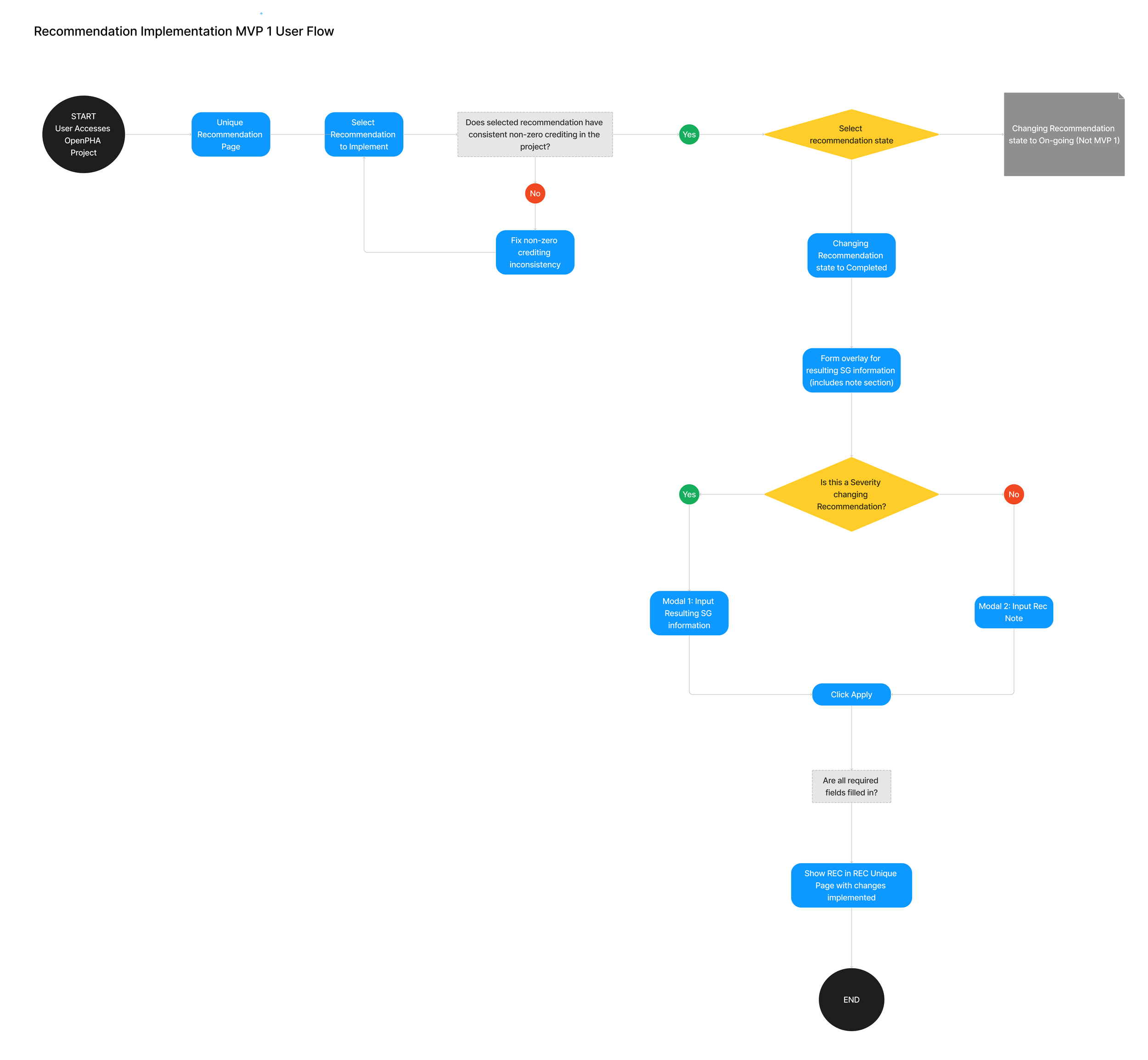
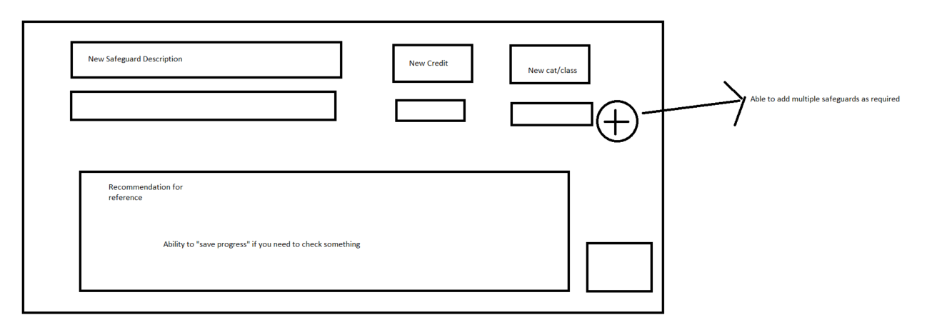
Pressed for Time
As coding on this feature had to begin before the design process was complete, I had to put something together fast. During a subsequent meeting, I drew rough sketches of the modal as a proof of concept for buy-in. The product owner found the sketches to be helpful in understanding my idea and approved it for further development. This also provided developers with direction on back-end development before design was nailed down.
Although this sketch was enough for buy-in and approval, I would loved to have the time and freedom to fully explore other options and layouts.
Wireframe Fidelity
The original plan was to complete mid-fi wireframes. But based on conversations with the development team, I determined that hi-fi wireframes were better suited for our needs due to:
Time constraints
OpenPHA is an existing shipped platform with an existing UI system. It was easier to communicate with the team using wireframes that are as close to the shipped feature as possible.
Experienced professionals such as our customers can give better feedback if the wireframes are as close to the shipped feature as possible.
Design Choices
Concern #1
Many users have Recommendations that either:
Lower the likelihood of the risk, but does not get rid of it completely.
Gets rid of the risk completely.
And our feature must account for both cases. I played with the idea of the two cases following different paths or modals but decided the user need is relatively and can be addressed in one modal. Most of the reference information will be the same for both cases so I used the same modal and a toggle to switch between the two cases.
Concern #2
Once Recommendations are completed, they will become new “safeguards” or safety protection layers. Many users want clear distinction between recommendation safeguards and the safeguards that were already existing. Furthermore, a recommendation of Case 2 above would remove the risk, so how would we help the user track erased risk information? The two ideas being considered were:
A marker in the data that shows the notes when hovered over.
Adding the deletion notes in a new data column.
I conducted a mini-research phase to gather data for this decision with 5 users from different companies. When asked about the marker system vs. a new data column for the deletion notes, users unanimously chose the marker system due to their familiarity with it. This was a definitive answer and also showed the value of user research to the team for future features.
Wireframe Iterations
This first iteration of wireframes were presented to the product owner, the development team and 3 internal stakeholders from the process safety engineering team and marketing team. The first showcase discussion resulted in the following iteration.
The product owner pointed out that the category clash may create a deadend for a small number of users, depending on their internal company guidelines. We have not done the user research to have evidence backing up this hypothesis, so for now it is more user-friendly to be accommodating by changing the flag from an error to a warning.
1. Removing Deadends
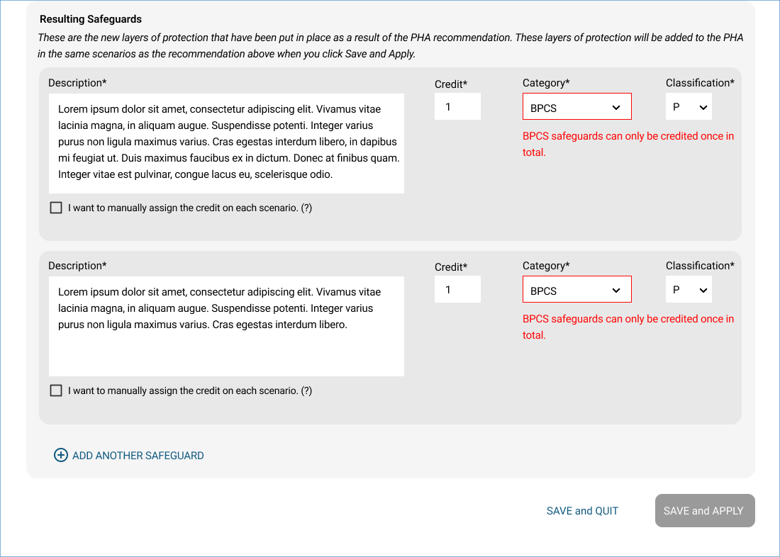
Wireframe before feedback: error and dead end
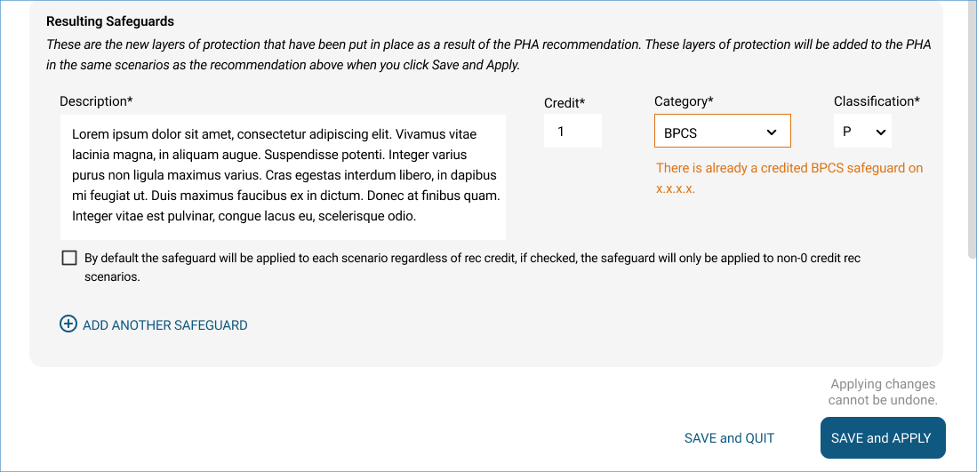
Wireframe after feedback: warning, no dead end
“Safeguard” is a common industry term, but having stated explanation for what is meant by “Resulting Safeguard” will accommodate less experienced engineers. This was prompted based on a question from an internal stakeholder to clarify terminology definition.
2. Helper text
Wireframe after feedback: helper text
Wireframe before feedback: no helper text
The development team noted that for MVP 1, applied Recommendation changes cannot be undone. The changes can be traced but there will be no function to support reverting the data to a previous version. This is an important point for the user to understand, so I added a note right next to the Save and Apply button to inform the user that changes cannot be undone once applied.
3. Technical Constraints
Wireframe before feedback: no note
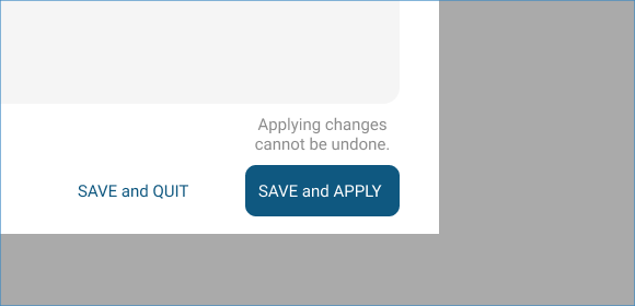
Wireframe after feedback: note for undoing changes
User Testing
To confirm our excitement for this feature, I showed hi-fi wireframes to a few external customers who are existing users of the OpenPHA platform for feedback. User feedback was overall very favorable toward the primary user flow – it was clear and intuitive, and no explanation was required for them to understand how to complete a Recommendation. Therefore, user testing did not result in any design changes for the primary user flow.
Shipped & QA
The design was handed off to the development team. To ensure UI looks the same as designed, I completed Q&A on the product and communicated changes via notes, screen captures, or screen sharing in a call with front-end developers if required.
This feature was shipped end of January, 2023. It was a big consideration factor that pushed two clients to sign on for a subscription license with us, and continues to be an attention-grabber for new clients. Several existing clients have used this feature to evergreen their process safety information and to produce up-to-date process safety reports for leadership.
Interim Persona
Based on other customer conversations and my knowledge of the industry, I came up with an interim persona:
A process safety engineer with considerable knowledge and experience in process safety management
Older, age 40-60
Not very technology savvy
Have a hard time following up chains of manual steps due to lack of time
Most often using this feature during focus time alone, not in a meeting or screen sharing.