
AHS: Preventive Care Mobile App
Solution
Prototype video coming soon!
⚠️
Design Constraints
📝
Research
My Hypothesis
🙋♀️
Persona
🚶
User Journey
🗺️
User Flow
✍️
I created the mobile app Preventive Screening to encourage Albertans to get preventive health checks such as the Pap test.
I focused on providing easy-to-consume educational information and an easy, digitized appointment booking process. The app falls in line with existing brand identity of Alberta Health Services (AHS), the single health authority for the province of Alberta.
Timeline
4 weeks (80 hours)
Collaboration
Solo project
My Role
UX Researcher
Product Designer
Platform
Figma
The primary constraint of this project is to abide by existing brand identity and design guidelines of AHS.
Many adults do not complete any preventive health screenings despite health expert recommendations to do so. On average, one in four women did not have a Pap test in the last 3 years, where the number can increase dramatically depending on location. To keep the scope manageable, I chose to focus on the Pap test amongst all recommended tests in the Canadian Health Guidelines.
The barrier against completing Pap tests (and by extension, other tests) are soft barriers (mental) rather than hard barriers (few clinics or no insurance).
There are a limited number of applications focused on preventive health screenings; however, an abundant amount of academic research papers and large scale surveys have been completed on the topic. Therefore, secondary research was primarily focused on literature review. Three academic papers completed in three different countries (UK, Taiwan, and America) were chosen to reduce location bias.
The papers had similar findings despite the geographical differences, therefore strengthening my original hypothesis.
The findings, in conjunction with the user interviews I conducted with women aged 25 to 55, are as follows:

Based on research, older women who had already completed a Pap test based on doctor recommendations are more likely to complete the test. Users who are typically younger and have never completed a Pap test will benefit more from screening education and a digitized experience.
From there, I defined the project persona:
30 year old biological woman who has never had a Pap test before
She is in relative good health
Motivation: wants to ensure her body will be in good health as she ages
Pain point: busy with a full time job and feels anxiety around vulnerability that is required by the test
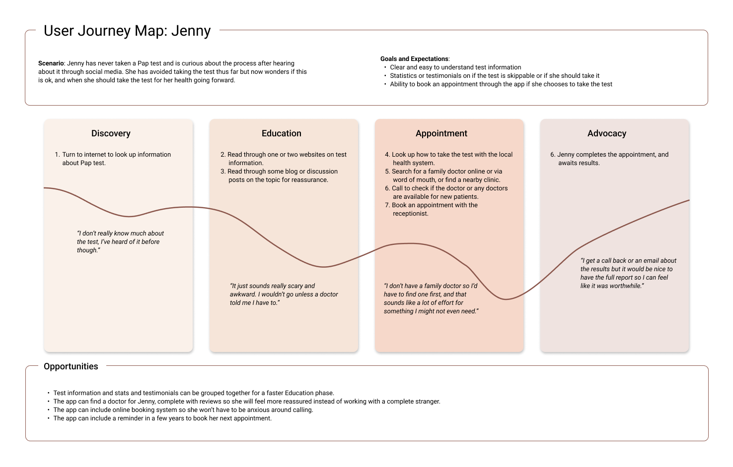
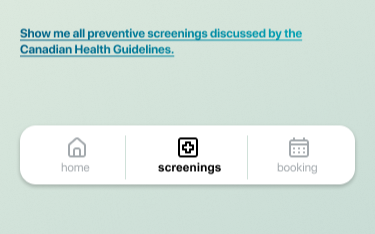
From research, I learned that the greatest barriers against testing are lack of education and difficulty with booking a test with a trustworthy doctor. Below is a flow for Jenny to learn about and book a Pap test.
The key insights are:
There are 4 phases of the user journey: discovery, education, appointment, and advocacy
The biggest barrier occurs during the appointment phase
Opportunities include reviews for doctors, an online booking system and stats and testimonials to encourage testing.
I was initially unsure of the onboarding portion of the app – should we give new users more freedom to explore information and book appointments to promote usage, or should there be more guidance on where to go and what to do?
From research findings, I know there is a sense of intimidation when it comes to health tests. People can find the medical information overwhelming. If not urged by a health practitioner they are more likely to abandon learning about the topic. Therefore, freedom to explore the app right away will add a layer of disorientation for the user and will not reduce this barrier against testing.
Hence, I chose to provide ample guidance through the user flow to encourage the user to complete the flow.
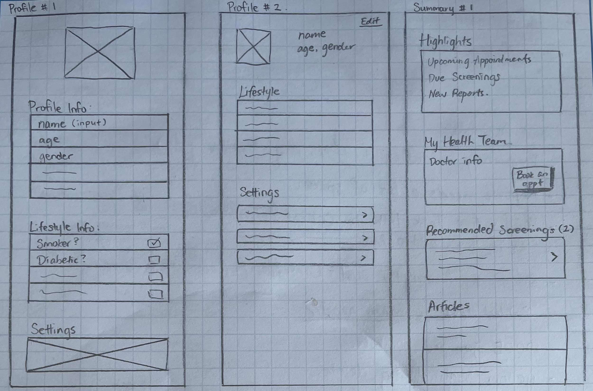
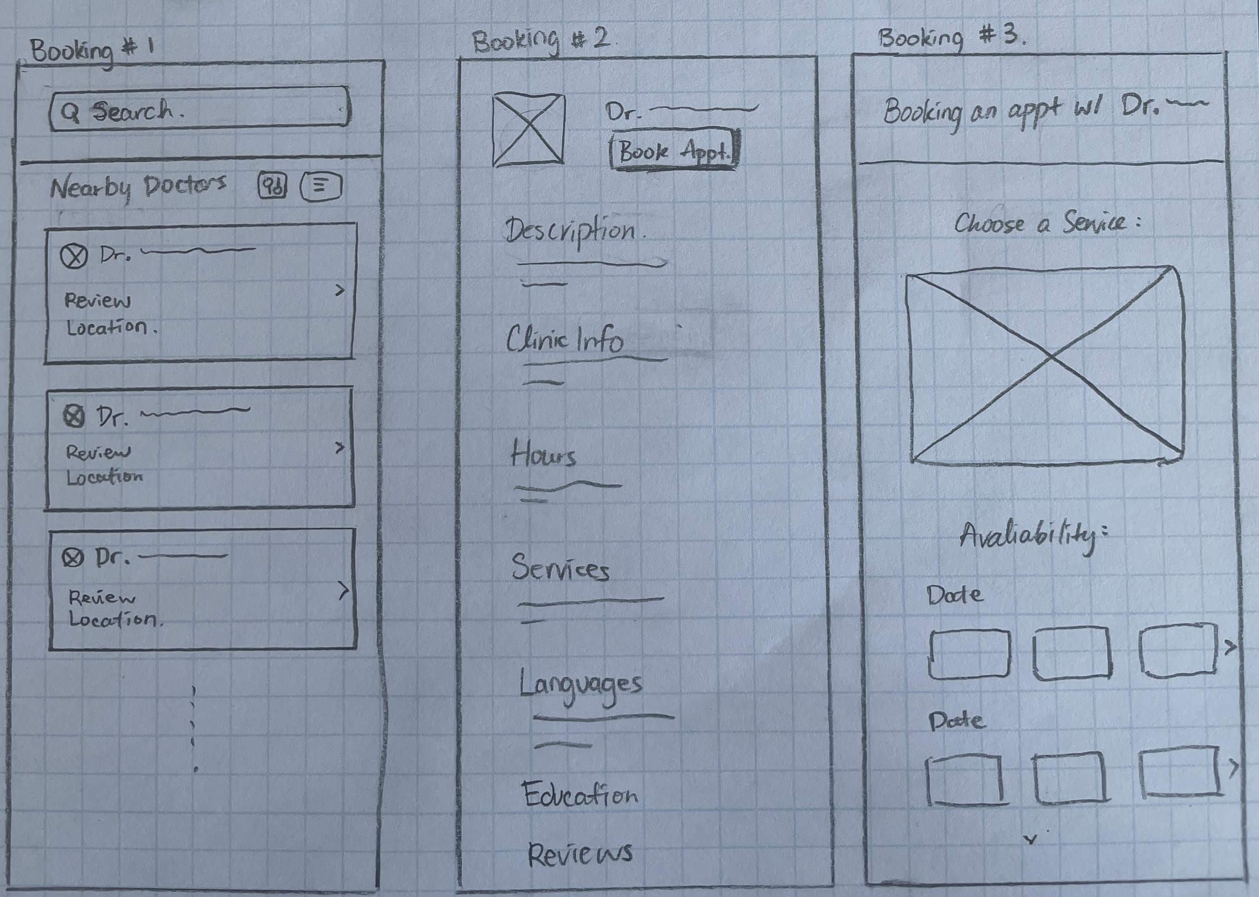
Sketches
My usual approach is to sketch ideas on paper, then moving to digital mockups. Layout and features were designed based on user interview findings. The main screens I focused on were the “education” piece and the “booking” piece. Since this was a solo project, the sketches were shown to other designers and developers in my network instead for feedback. This peer critique session did not result in significant changes to the sketches.
🎨
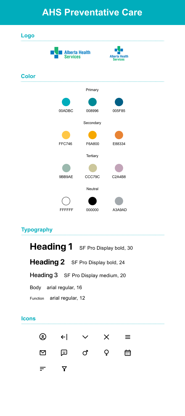
Style Tile + UI Kit Development
As this project is completed with Alberta Health Services (AHS) as the proposed client, it was critical that the app complies with AHS branding. I located the AHS branding guideline through their website, and made small changes to ensure the app is still unique compared to other AHS apps. Below is the UI kit I created for this project.
🔁
Wireframe Iterations
Using hi-fi wireframes based on the sketches, I created a prototype to use for peer feedback as well as moderated testing. Overall, participants enjoyed the color palette and branding. All participants completed the open-ended tasks without issue or confusion.
The most frequent feedback/issues are as detailed below.
1. Accessibility
The original wireframe featured gradient text on a colored background which can be difficult to read due to low contrast. I changed the link text color to a solid one, and adjusted the background color to increase readability. The new colors were ran through accessibility tools to ensure they pass accessibility guidelines.
Wireframe Rev 1
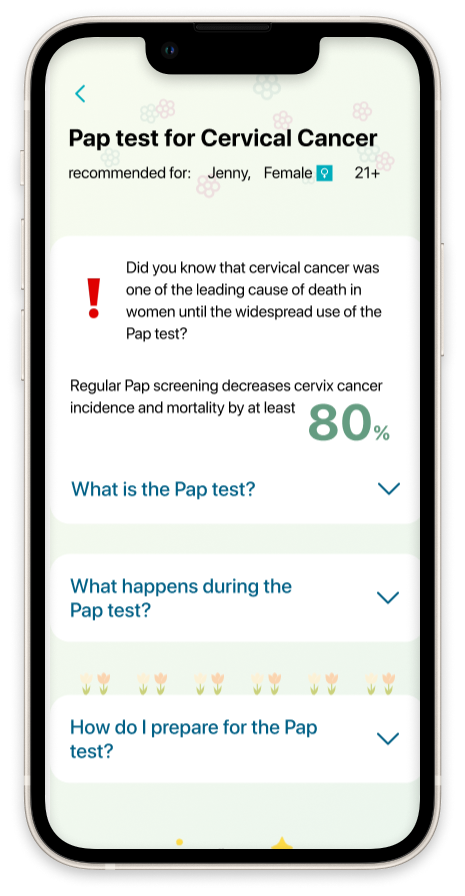
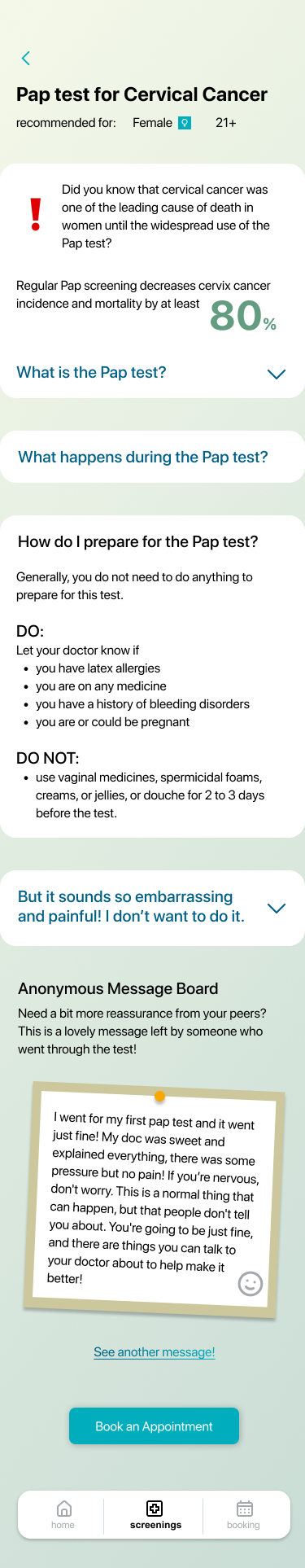
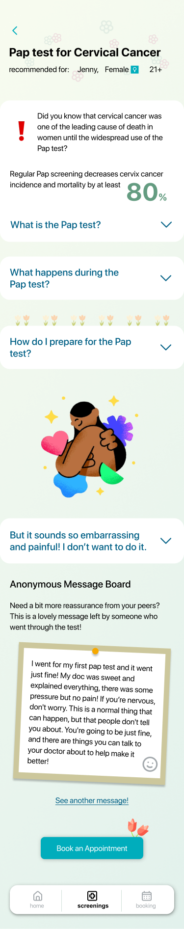
Although users were happy with the content presented in the Pap test page, I received the feedback that the app is bland to look at.
I added more imagery to invoke a positive and cheerful feeling, especially on the text-heavy Pap test information page.
Wireframe Rev 1
Wireframe Rev 1
Wireframe Final Rev
🎓
Wireframe Final Rev
2. A More Welcoming App
Wireframe Final Rev
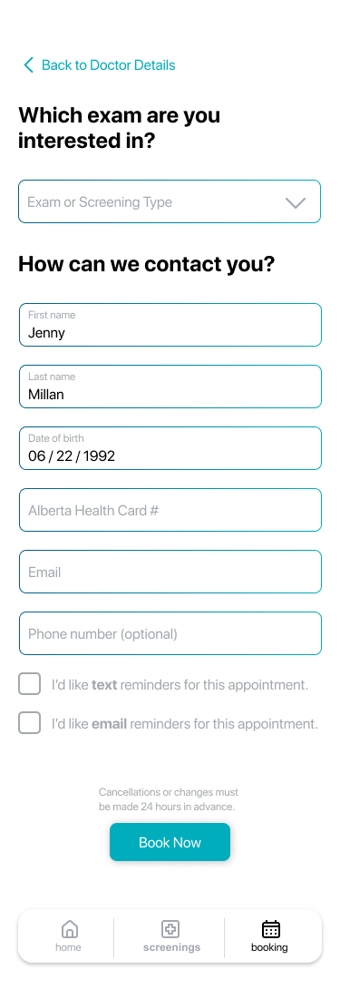
3. Personal Information Miss
During testing, users pointed out that the booking process did not ask them for an contact information or identifying information. This was a miss from the initial peer feedback cycles! To address this, I added an extra screen for users to input their contact information as well as their Alberta Health Card Number, which is an identifier with AHS.
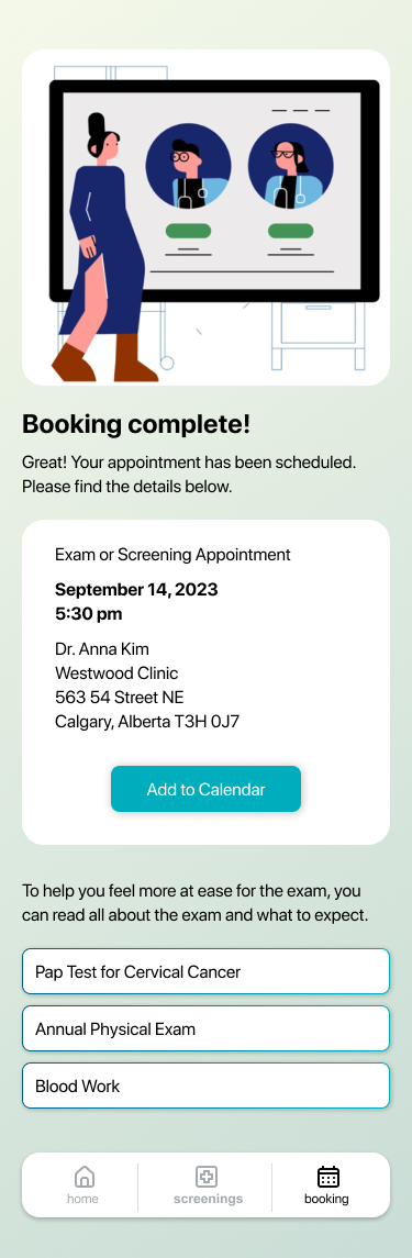
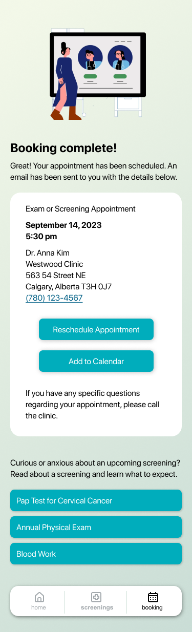
4. Booking Confirmation Page
One user asked how they can contact the clinic should they have any specific questions, and it was unclear where and how the appointment can be rescheduled. The re-direction text at the bottom of the page was also confusing. Users did not understand if the available buttons were showing everything they are expected to do at the upcoming appointment.
I added information, CTA and re-worded the text on this screen to address these issues.
Lessons Learned
This was a solo project set up to be more focused on the research phase since I am interested in UX research. While I am very satisfied with the research aspect of this project, the execution was less smooth than my other projects. If I were to re-do this project, I would spend more time on the wireframes to build a more complete application and address some user flow questions I encountered during testing.