
Seize Apparel
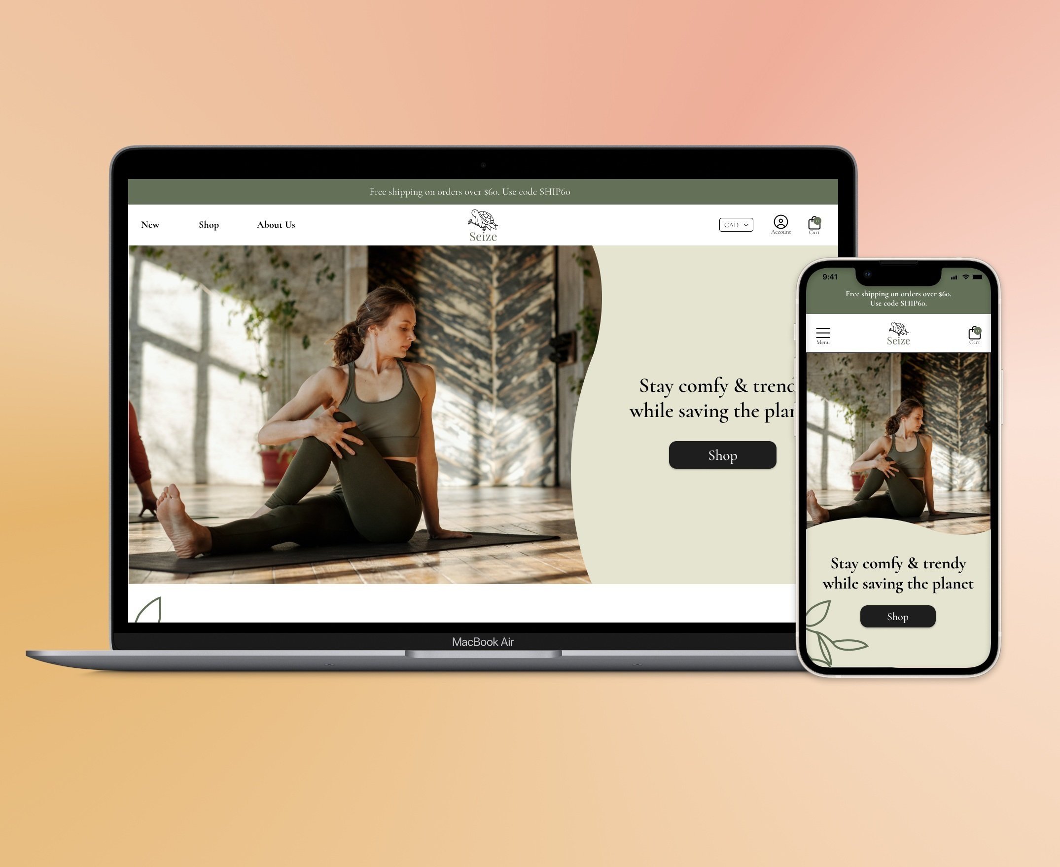
Responsive e-commerce website for an eco-friendly women’s fitness apparel startup.
How might we create an e-commerce website that is efficient to browse, and provide an enjoyable shopping experience?
Seize Apparel, a local startup that focuses on sustainably and ethically crafted women’s activewear, needed a website for their upcoming soft launch. The owners asked me to design the website and online store to clearly communicate their values and to sell their products online.
In 4 weeks, I delivered a set of key screens that offer a smooth shopping experience with focus on storytelling. The design is adaptive to different screen sizes because many people now discover and browse online stores with mobile devices.
Overview
Timeline
4 weeks (80 hours)
My Role
UX Researcher
UI/UX
Product Designer
Content Strategist
Collaboration
2 Business stakeholders
Platform
Figma
✅
Solution
🚧
Design Constraints
I initiated 2 meetings with the founders to clarify company state, project goal, target audience and what success looks like for this collaboration. In doing so, I uncovered the following design constraints:
No product photos provided from the client. Instead, I used placeholders by choosing photos consistent with the company branding from royalty free resources.
Website had to be relatively simple for clients to build, as they are first time business owners and have never built or maintained a Shopify website.
📝
Competitive Analysis
I researched similar activewear apparel brands – 3 niche companies and two mainstream companies that share a similar target audience as Seize.
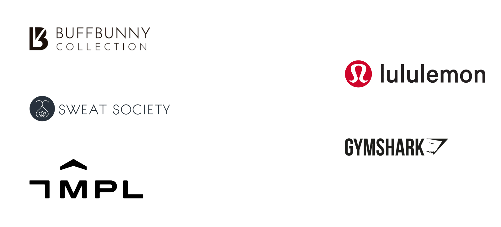
Findings:
Heavy use of photos on their homepage to promote featured clothing.
Clean UI and intuitive navigation features that engage users to enjoy browsing more products, such as filter and search functions, product availability without needing to click into the product details.
Suggestions for similar items or outfit ideas.
Fast growing brands all leveraged the trendy aspect of their clothing to connect with social media influencers and sell a lifestyle or an aesthetic rather than just the clothes.
💬
User Interviews
During this project, I conducted user interviews with women aged 20 to 39 who are consistently active. Out of these users, 60% mostly shop using laptops or desktops, and 40% mostly shop using mobile devices.
Key takeaways from these interviews:
Participants strongly value social media trends and reviews.
Participants regularly struggle with finding comfortable activewear that fit well.
No behavioral differences when shopping for activewear vs. other types of clothing.
Vague shipping and return information are frequent deal-breakers.
Most participants are aware of textile sustainability but will not actively seek out companies supporting it.
They are much more likely to purchase if the company can convince them that sustainable and ethically produced clothing are important or better.
🔍
Critical Findings
I distilled the secondary research and user interview findings into key insights that will influence the design:
Efficiency, cleanliness, and convenience are necessary for a good e-commerce website.
Content needs to be obvious, clear, relatable, and compassionate.
People are more receptive to advertisements on social media on mobile devices.
Features should tackle the biggest pain point of online shopping – fit and quality.
Target audience expect companies to demonstrate a heightened sense of authenticity and transparency in everything they do.
✋
Uncovering a New Problem
It was clear from user interviews that emphasis on Seize’s core message of ecofriendly clothing is just as important – if not more – for a budding company. This is different from my initial hypothesis and approach to the issue, which was greatly focused on the e-commerce aspect of the design. The new problem statement becomes two-fold:
How might we create an e-commerce website that is efficient to browse, and provide an enjoyable shopping experience?
How might we present the company story in a personable and empathetic way that can help customers see the benefit of sustainable clothing?
👩
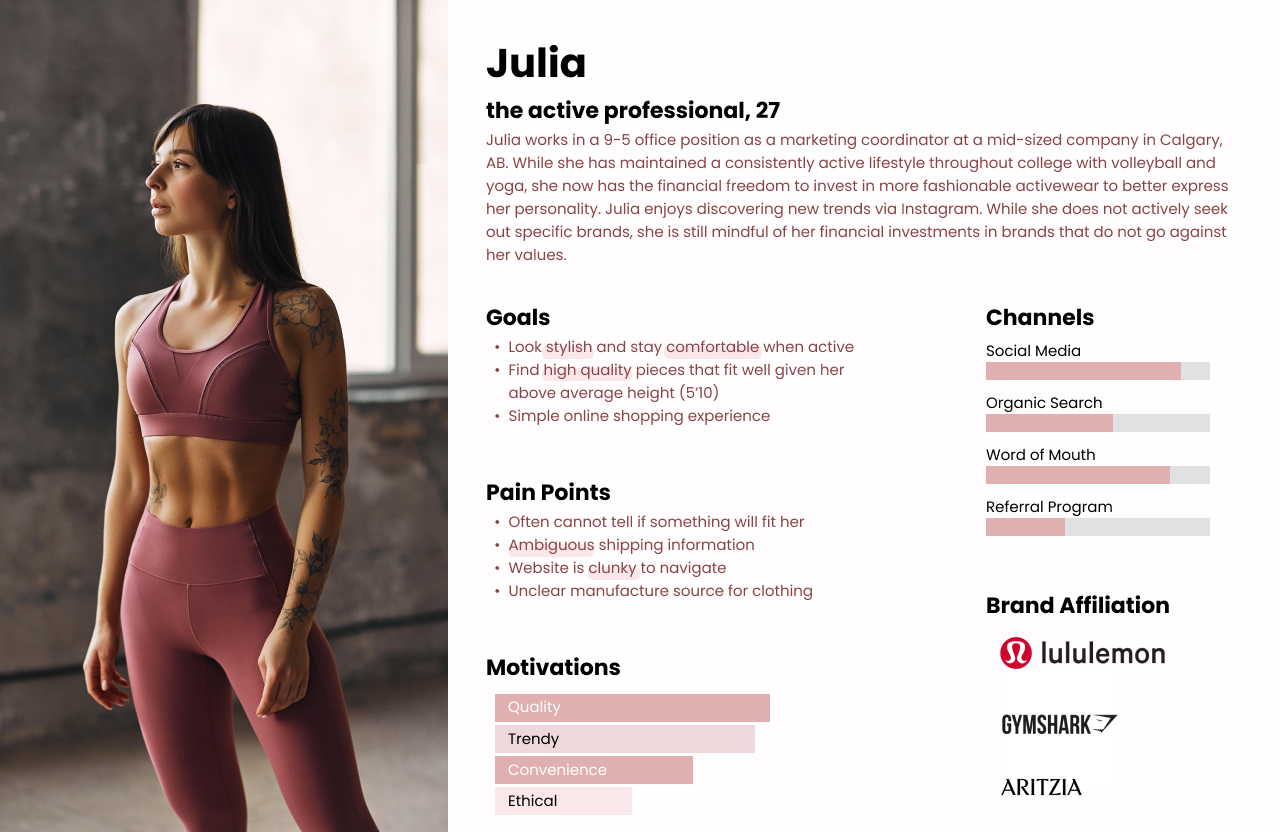
Persona
Many interview participants shared characteristics and behavior such as having a steady income, relying on social media and word of mouth, and lacking free time and patience to browse and deal with hassles such as returning an item.
These traits were built into the persona to better align with both problem statements.
🚶
User Flow
I created a user flow to accommodate multiple scenarios to help me define key pages and functions required in this site. See the user flow here.
🗺
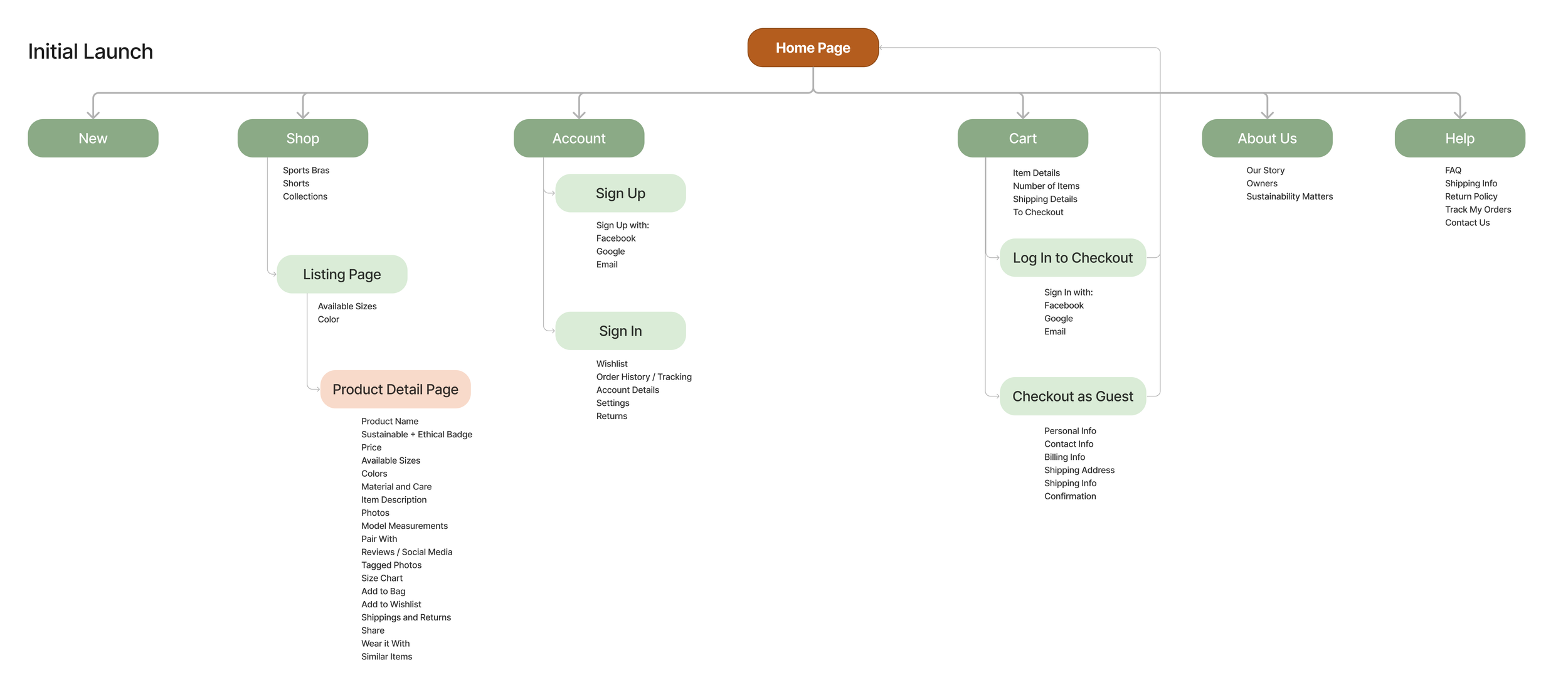
Information Architecture
The site map needed to accommodate required features and also work for a startup (company is launching with 6 products). I first built a “future version” of the site map that contains the ideal structure based on industry practices and user research. However, the site map needed to accommodate the required features and also work for a startup (the company is launching 6 products to start). So I took away the non-applicable items for the “current version” shown below. This efficiently ensured the site map is scalable and fitting for the initial launch.
✍
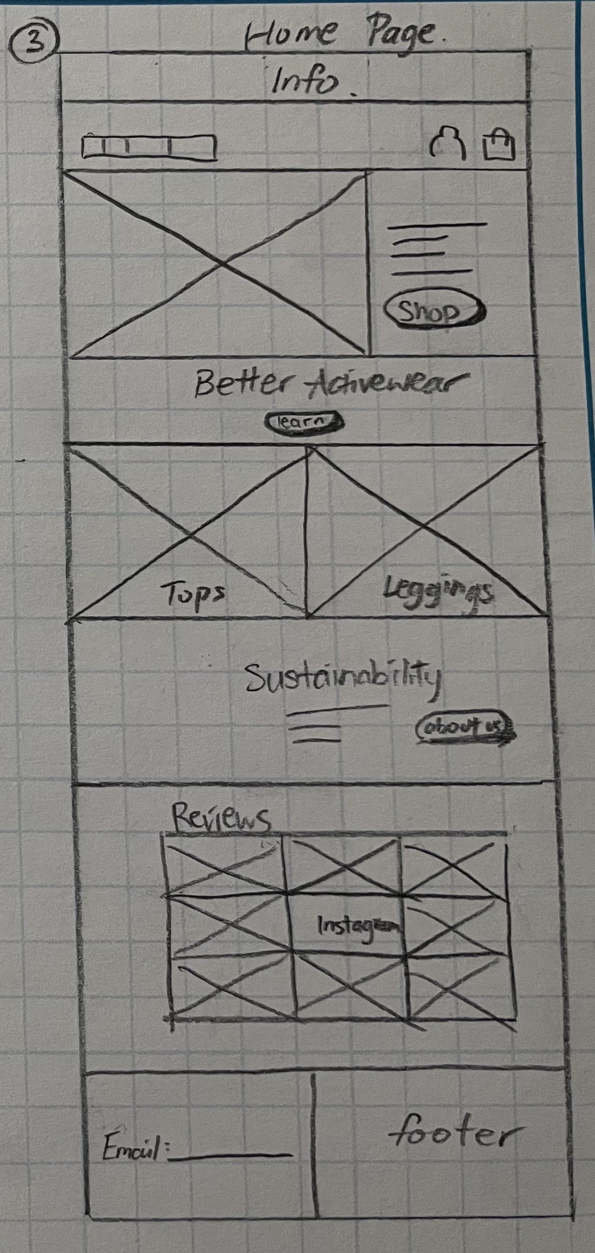
Sketch First
My usual approach is to sketch ideas on paper, then moving to digital mockups. Layout and features were designed based on user interview findings. During this stage, I presented the sketches to the owners to ensure their questions are answered.
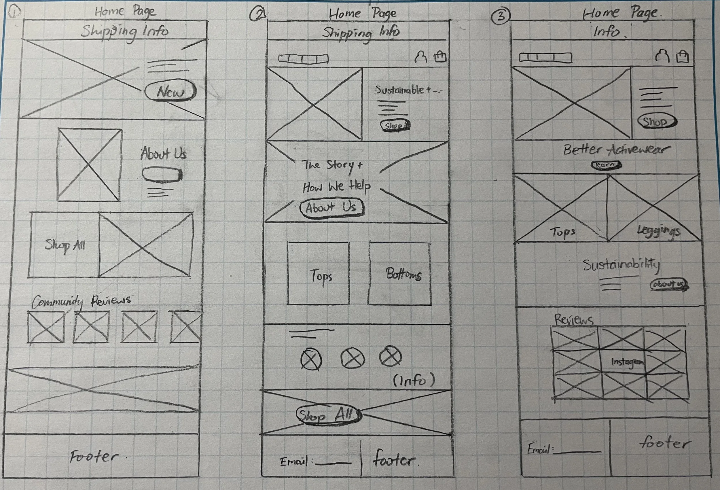
1. Feedback on Home Page
Among the sketches for Home Page, the owners and I decided on option #3 since it is the strongest in story-telling. There was some debate around if Reviews should be included, since Seize is a startup and the owners were concerned with generating enough social media reviews. A callback to the user interviews on the importance of social media reviews helped me convince the owners to keep the Reviews section.
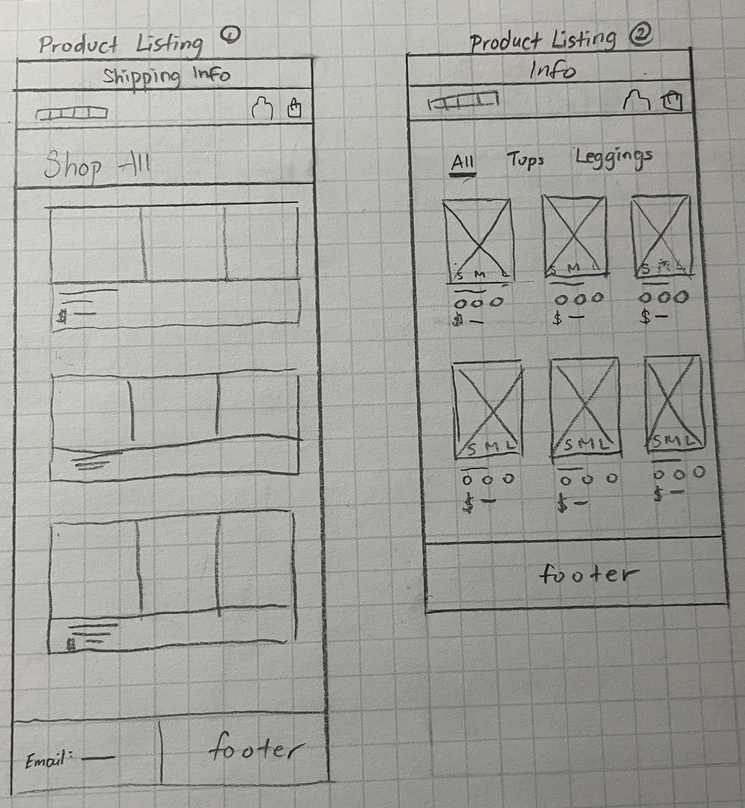
2. Feedback on Product Listing Page
As the company will be soft-launching with only a handful of products, I had to find a strategy to prevent the product listing page from looking empty or boring. Below are the two variations shown to the owners. We decided on option #2 since option #1 can look unrefined and clunky to use once more products are added in the future. To increase engagement with the user, I added CTA cards alongside product cards. This way the page will be more exciting to browse.
🎨
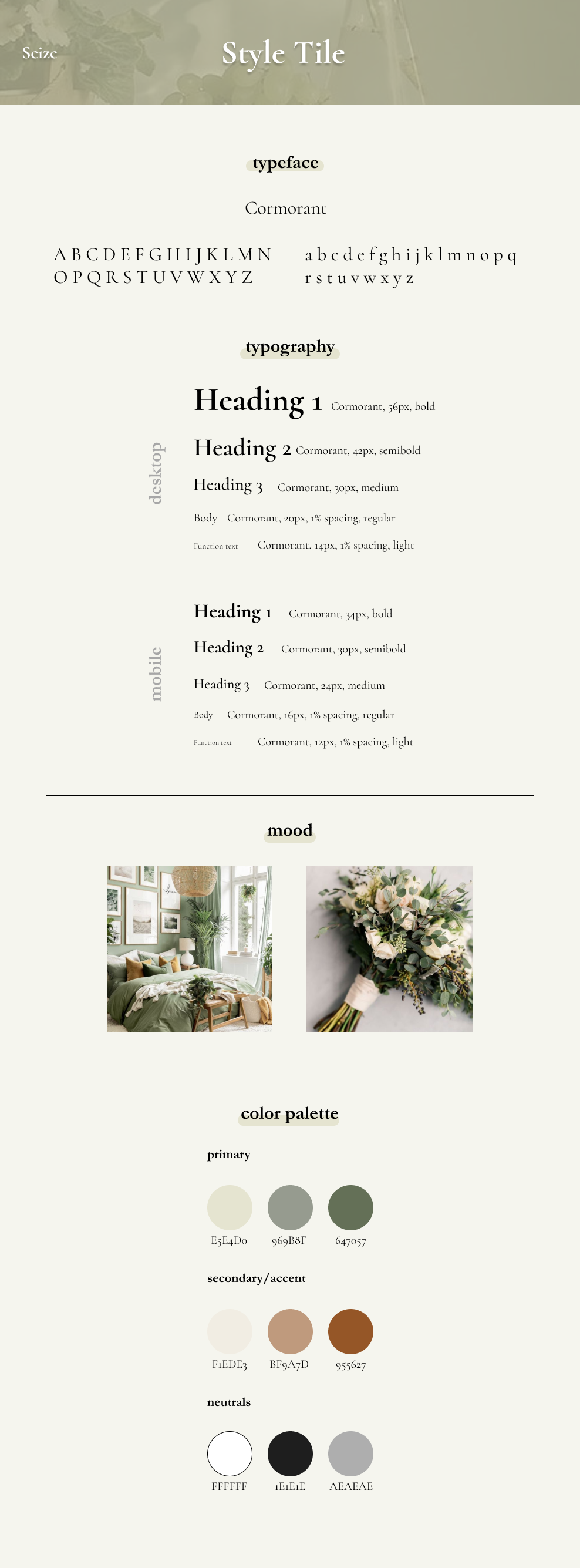
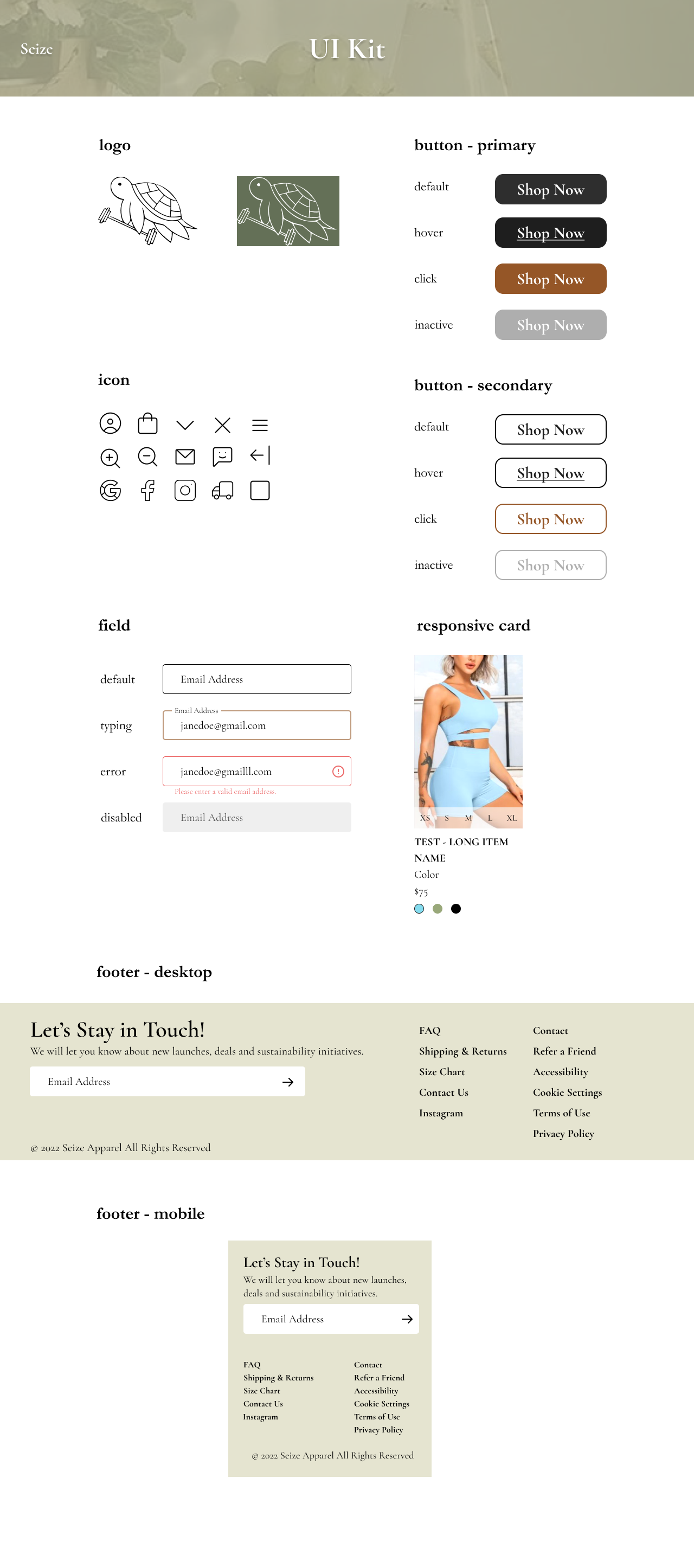
Style Tile + UI Kit Development
At this stage, the client did not have a solid idea on the color palette. I put together a mood board based on key company values to help them eventually decide on a happy choice of green and earthy tones. From there, I constructed a style tile and a UI kit for the foundations of a design system.
🔁
Wireframe Iterations
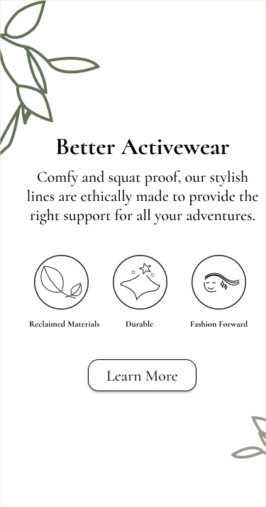
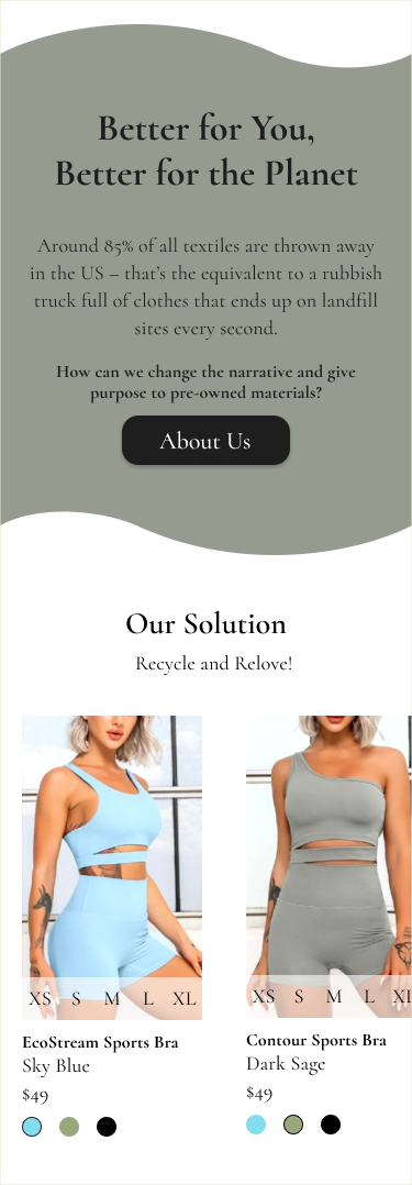
1. Improved Storytelling
The original wireframe featured several focus points on brand message and less pushes to the product pages. After showing the design to the stakeholders and group-critiques, I received feedback that there was no solid connection between the company story and the products.
Based on our discussions, I re-phrased the sustainability aspect as a problem, and presented the products as the solution on the Home Page. This way, a user like Julia can easily understand the company mission and have more trust in the company and its products.
Home Page Sketch
Wireframe 1
Wireframe 2
2. Applicable Features
Originally, the user can access similar items from the Product Detail Page. This is a common feature for e-commerce sites. Upon reviewing with the stakeholders, I realized that because Seize is a small start-up, the initial product catalogue will be fairly small. The stakeholders had little visibility on when the catalogue will expand. So for the foreseeable future, there will not be enough items to make this feature useful to the users. For similar reasons, the Search feature is also not very useful in this instance.
I removed the Similar Items feature and Search feature from the final wireframe so the website only has content that users will find helpful to achieve their goal.
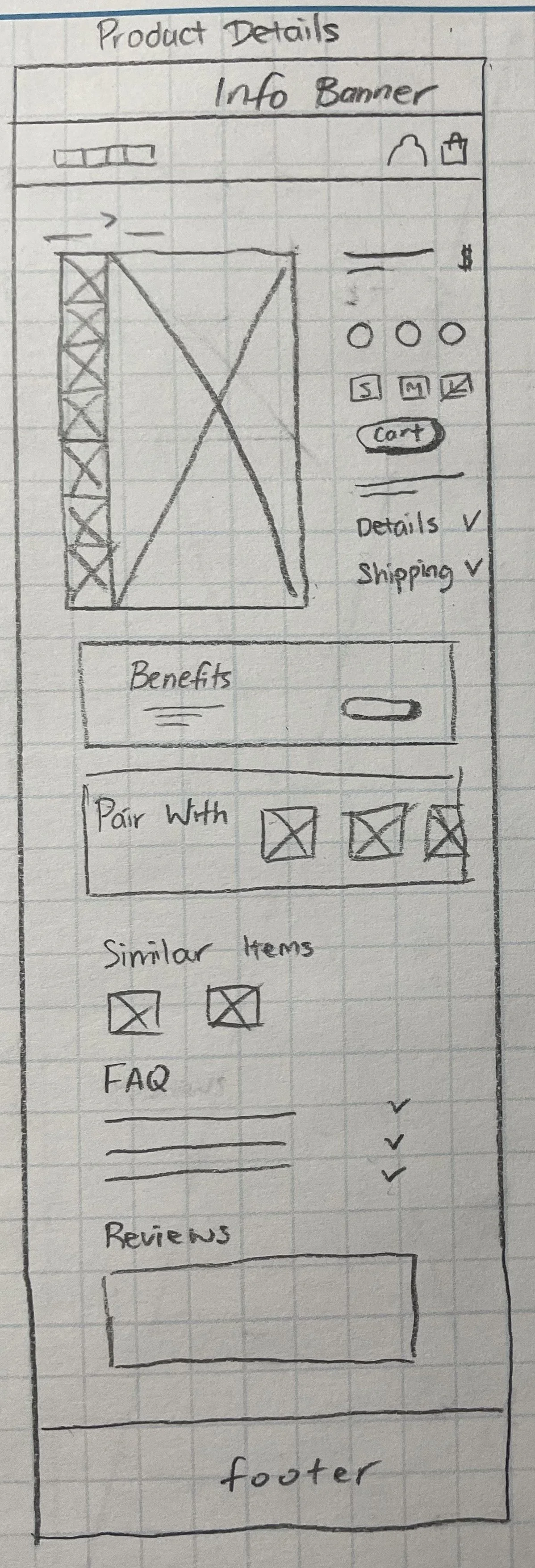
Product Details Sketch
Wireframe 1

Wireframe 2
💻
Time to Test!
Using the client-approved wireframes, I created a prototype to use for moderated testing. Overall, participants enjoyed the color palette and branding. Many gave positive feedback on the About Us page layout with enthusiasm. All participants completed the open-ended tasks without issue or confusion.
The most frequent issues are as detailed below.
Issue 1. About Us Page too long
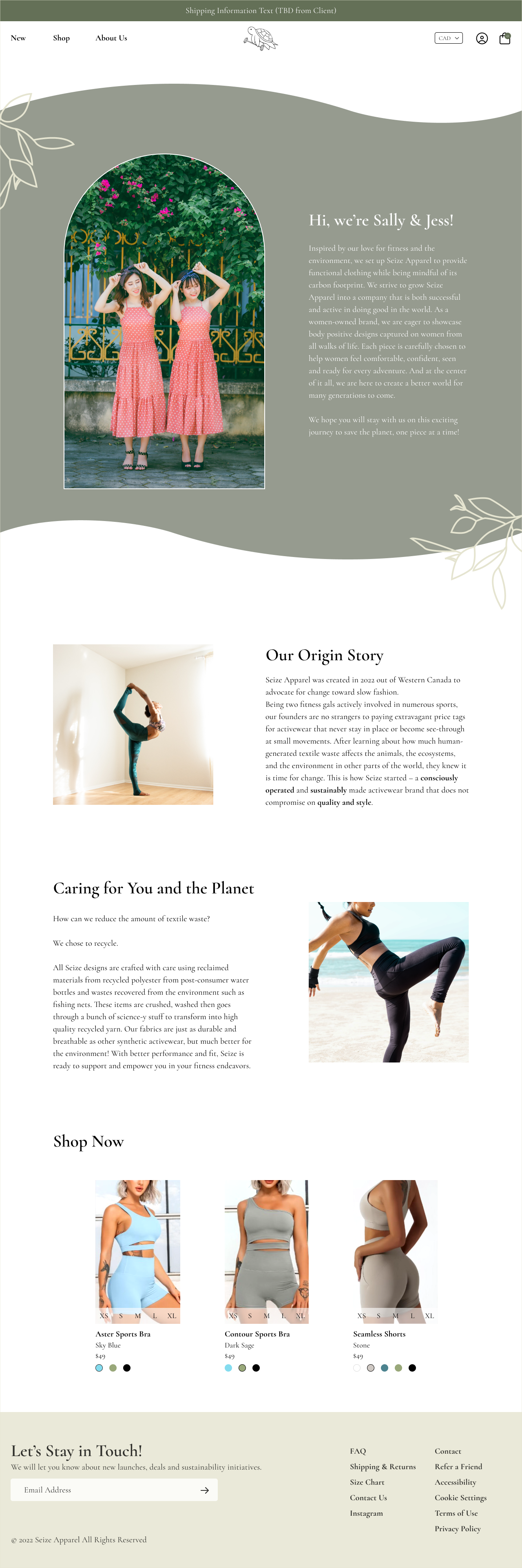
Many users provided feedback that the About Us Page contains good content, but the page takes too long to get to the point or does not entice the user to read through it. Users often missed key company values and did not completely buy in to the company values of sustainability.
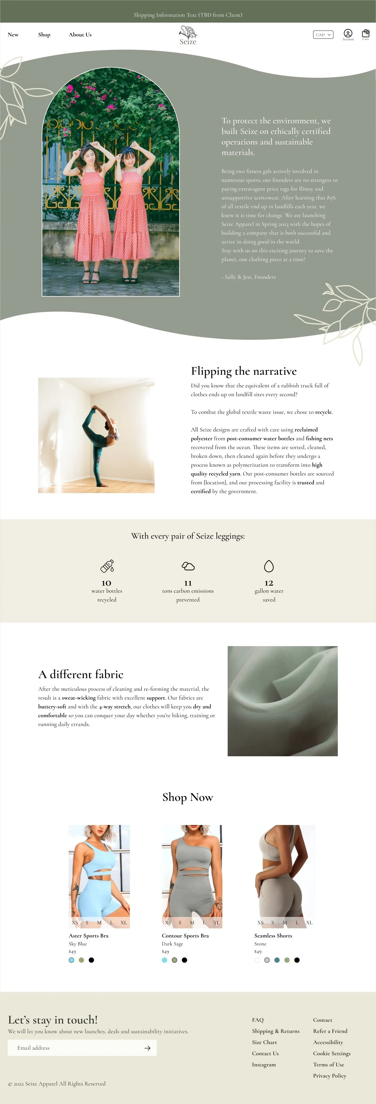
To address this issue, I re-wrote the content on this page so it can deliver more information and impact. The overall content is sectioned so each paragraph has a more focused central point, which is highlighted by a clear title. I made more use of type styles to bold the important keywords so the page is easier to skim and still catch the relevant information. I also added a section to convey the amount of waste prevented by each Seize product for a tangible and digestible metric to build trust with the user.
Issue 2. Sustainability aspect can be more obvious
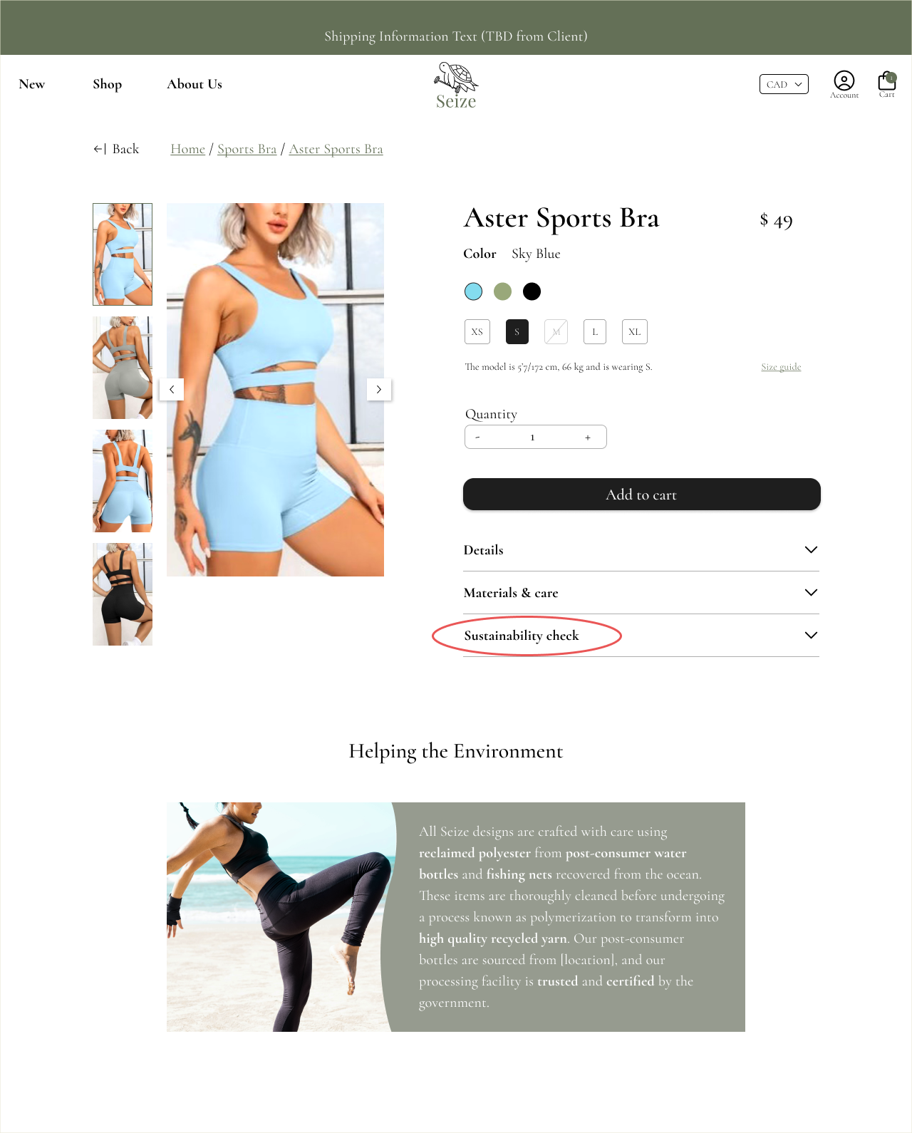
Users provided feedback that the sustainability aspect of Seize Apparel is not immediately obvious on the Product Detail Page.
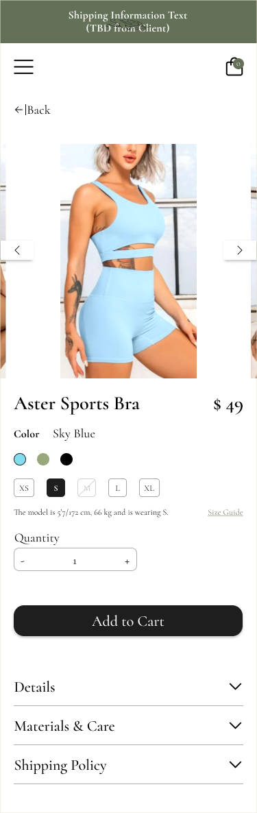
I decided to add the Sustainability Check tab in the main product information accordion. And also added a section on how Seize products help the environment to make this information more readily available for the user.

🎓
Lessons Learned
This was my first design project working with business stakeholders with no prior knowledge of design. During our conversations, I worked hard to communicate the importance of certain design choices to non-designers. Through user interviews, I uncovered another aspect of the problem which I did not consider before, which lead to my growing appreciation of the value of research. It’s an interesting field, and something I would like to dig more into in future projects.
Given more time I would have liked to complete another round of testing focused specifically on the sustainability piece of the product. Are users ultimately happy with the new information or is there anything else specific they are looking for? I would have liked to do A/B testing for the About Us page. I thought about making the About Us into two pages – one solely focused on message from the founders and another focused on the product. Which one would users like more?
Other design changes I would like to try and test would be to make changes on the product detail page. After delivering the final wireframes to the client, I realized that the model information is text content on the page, separate from the images. This implies that only one model can be shown on the main carousel which does not adequately answer questions around fit for users. I would like to re-design this page so it is more inclusive to more models.